Swell Energy Isn't a Predictive Feature
Like most folks whose talents lean towards the quantitative rather than artistic, I wanted to, at least over time, find hard quantitative methods for predicting wave heights and wave push/power. I was hoping a combination of those two features would allow me to predict all of my forecast programatically (eg. objectively) and ideally even recommend surfboards for a given day. I had hoped that a solid formula for wave energy was the key to all of this. In the rest of this article, I will explain why it wasn’t.
I like pictures, so let’s look at the last decade of buoy data after calculating wave energy. The following are density histograms (probability of a given energy, by number of instances):
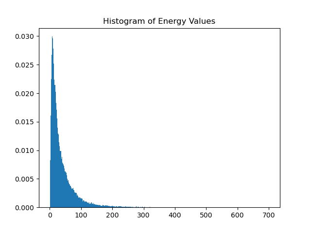
What you see here is the density of energy values over time. From common sense and experience, we know the east coast is flat more than it isn’t, so we have an expectedly large number of small energy values. Most swells are around waist-stomach high and of relatively low energy, so that follows as well. Then there are the occasional extremely powerful swells making up what we call the tail of our probability distribution.
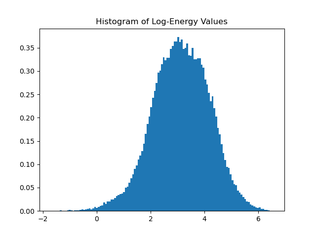
Those of us that have been around statistics for awhile will recognize this distribution as being log normal, meaning if we take the log, we should get a normal distribution. Let’s look at that:
What we end up with is pretty close to a true normal distribution. I fit a normal distribution to the log scaled values yielding:
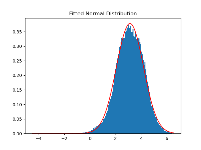
As we can see, a normal distribution fits our data well. This distribution is actually how the energy percentile values get calculated. More on that later.
Now, we have our energy calculated and have enough forecasted values to see if we can predict surf heights. Let’s look at a scatter plot of forecast heights relative to buoy energy values (prepare to be disappointed):
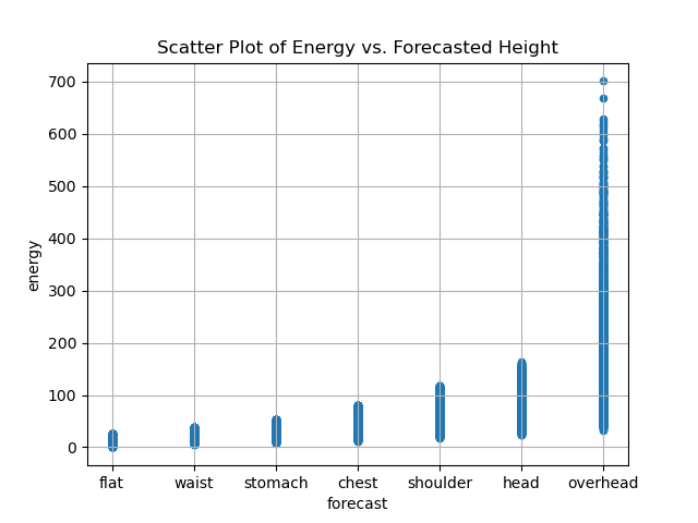
What we want to see is ideally no overlap in the values as we look left to right. Essentially, we want a linear relationship (though some uncertainty would be acceptable). To understand why this doesn’t work, imagine a line being drawn at a y-value of 50. It would intersect stomach-overhead values.
There’s multiple reasons for this. It’s important to have an equation for energy that takes into account the perceived energy difference between short period swell (wind swell) and long period swell (ground swell). By doing that, we weaken the correlation between wave height and swell energy. This is desirable considering lived experience getting thrashed around by small, hollow, punchy surf, and being disappointed by soft, mushy, short period but larger surf.
So, wave energy isn’t particularly predictive of height, at least at our breaks. That said, we can use it as context for a future swell. This is why I started using energy percentile as a value in my forecast tables. An energy value itself is pretty worthless unless you look at swell tables every day (only me?). But, if you don’t, this value will quickly tell you that a given day is X% more powerful that every other day in the past decade. So, if you see a value of 75, that means to expect waves that are more powerful than 75% of swells. A value of 50 means that it is a standard, normal swell and to expect an average amount of wave energy (independent of size). On the other hand, if the wave height is larger and the percentile is smaller, expect softer than average conditions for that height, etc.
I know this article got a bit math heavy, but it’s interesting stuff. I hope you learned something about surf forecasts through this and are better able to read them going forward.